Indian Railway Network Coverage Analysis and Station Site Planning
8,801 railway stations, three trained ML models, and a live map that tells you where India actually needs new stations. Full Python source code plus a Flask dashboard you can run tonight.
Technology Used
Python | scikit-learn | NetworkX | Flask | Leaflet.js | pandas | Chart.js | SciPy


Abstract
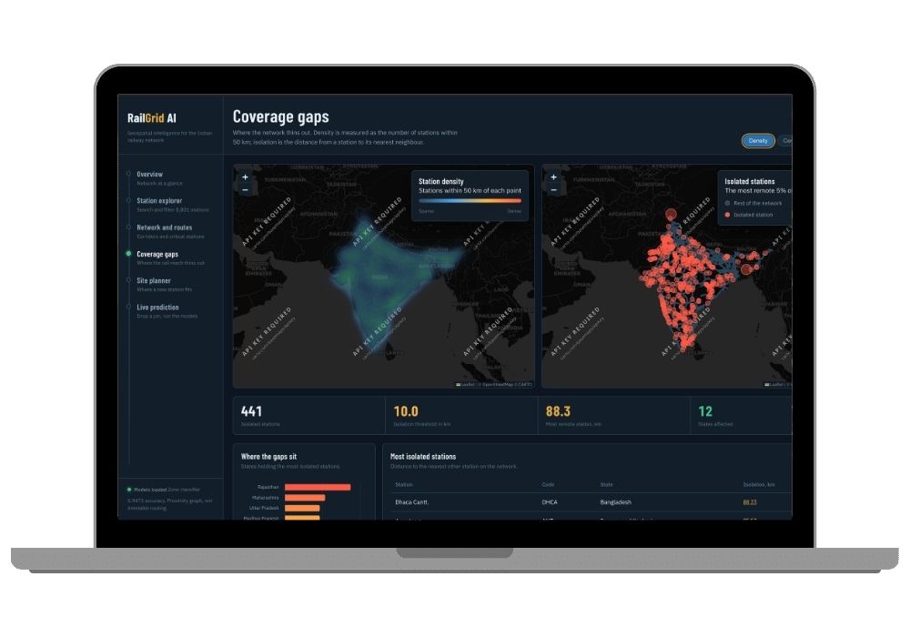
RailGrid AI takes a flat Kaggle table of Indian railway station coordinates and turns it into something an actual planning department could use. The dataset gives you station name, code, state, zone, latitude, longitude, junction flag and route count for 8,801 stations after cleaning. What it doesn't give you is connectivity — there are no station-to-station edges anywhere in the file. So the project builds that structure itself, using a BallTree nearest-neighbour search with the haversine metric to connect each station to its 8 closest neighbours within 120 km. NetworkX then runs shortest-path traversal, degree analysis and betweenness centrality on top of that derived graph.
Four analytical modules sit on that base. A Random Forest zone classifier recovers 4,437 missing railway zone labels at 94.7% accuracy. A coverage gap module uses Gaussian kernel density estimation and nearest-neighbour distance to flag 441 isolated stations. A grid-based recommendation engine scores 0.5-degree cells across the country and returns 20 ranked sites for new stations. And a route count regressor estimates junction traffic from spatial context alone — deliberately excluding is_junction and station_count_in_state, because both leak the target straight into the model.
The whole thing ships as a Flask 3 REST API with 12 endpoints, wired to a Leaflet dashboard with six pages of maps, heatmaps, corridor tracing and live prediction.
What This Project Actually Does
Think of it as four questions asked of one dataset.
Where are the gaps? The coverage module measures how far each station sits from its nearest neighbour, flags the top 5% as isolated, and draws a density surface over the whole country. You end up with a heatmap where thin regions are obvious at a glance instead of buried in a spreadsheet.
Which stations hold the network together? Betweenness centrality on the proximity graph ranks stations by how much connectivity flows through them. Pull one high-centrality node out and the network fragments.
Where should the next station go? A 0.5-degree grid gets scored on three components — distance to nearest station (0.45 weight), sparsity within 100 km (0.35), and access to the nearest junction (0.20). Cells under 30 km from an existing station get rejected as redundant. Cells over 160 km away get rejected as unreachable. Top 20 survivors come back ranked, with catchment rings drawn on the map.
What's missing from the records? Roughly half the rows have no railway zone. The classifier fills them in and attaches a confidence score to every single imputed value, so you can filter on it later.
The One Thing That's Genuinely Hard Here
Target leakage. In this dataset, is_junction is derived from route_count — every non-junction has exactly zero routes. Feed route count into a junction predictor and you'll get near-perfect accuracy that means nothing at all. The notebook prints the crosstab, documents the exclusion, and reports an honest 68.4% accuracy instead of a fake 99%. If your examiner asks one sharp question during viva, it'll probably be this one. Good news: the answer is already written out for you in the notebook cells.
And the Thing That's Easier Than It Looks
No GPU. No cloud account. No dataset licensing headache. The models are Random Forests and Gradient Boosting from scikit-learn, and the full training notebook runs top-to-bottom in 3 to 6 minutes on a normal laptop. You run railgrid_ai_training.ipynb, it spits out models/, outputs/ and figures/, you drop those next to app.py, and the dashboard comes alive.
Key Features
- Click any point on the India map and get back a predicted railway zone with a probability chart, junction likelihood, expected route count, and distance to the nearest existing station — all three models fire on a single POST to
/api/predict - Zone classifier: 400-tree Random Forest with balanced subsample weighting, 5-fold stratified CV, benchmarked against a distance-weighted KNN baseline. Accuracy 0.9473, weighted F1 0.9451
- 4,437 missing zone labels recovered, each carrying its own confidence score
- Proximity graph with 8,801 nodes and 41,752 edges, exported as
railway_proximity_graph.graphmlso you can open it in Gephi if you want extra viva ammunition - Corridor tracer — type two station codes and it draws the path between them with a vertical stop sequence and total distance
- Coverage page with switchable heatmaps (density, centrality, traffic) side by side with an isolated-station map and a state-level gap chart
- Site planner rendering 20 numbered recommendation markers with catchment rings scaled to unserved radius, plus a score breakdown chart
- 14 generated analysis figures — confusion matrices, ROC curves, feature importance plots — ready to paste straight into your report
- 12 REST endpoints returning clean JSON, with models and the spatial index loaded once at boot and cached in memory
- The app serves a setup page instead of crashing when model files are missing, so a half-finished install doesn't leave you staring at a stack trace
Real-World Applications
First-pass infrastructure shortlisting. Before anyone commissions a terrain or demand study, someone has to decide which 20 locations are even worth studying. That's exactly what the site scorer produces — a geographically justified shortlist that filters out both the redundant spots and the unreachable ones.
Coverage equity reporting. "Region X is underserved" is an opinion until you attach a number to it. The density surface and isolation flags turn it into a measurable claim with a state-wise breakdown.
Maintenance and contingency prioritisation. Centrality rankings tell you which stations, if disrupted, would break the most routes. That maps directly onto where upgrades and disaster planning should go first.
Warehouse and retail siting. Any logistics business picking a distribution hub needs rail proximity as an input. The predict endpoint answers "what's the rail context at this coordinate" for anywhere in India.
Repairing messy government datasets. The zone classifier is really a general recipe for recovering missing categorical labels in any spatial registry. Same approach works on postal circles, district codes, forest divisions, whatever.
Who Should Buy This
If you're a student who needs a working project for your college submission, final-year project, semester project, internship, or academic demonstration, this is for you. Whether you're studying BCA, B.Tech, MCA, M.Tech, Computer Science, IT, AI, Data Science, or another related field, you can choose a project that fits your requirements. If you need the source code, project report, documentation, or help setting up and running the project, CodeAj gives you the resources and support to get started faster.
Honestly, this one suits you particularly well if your guide keeps saying "your project has no novelty." Reservation systems and railway booking portals get submitted by four teams every year in every college. Nobody submits a betweenness centrality analysis of the station network. Browse the rest of the AI and ML final year projects if you want to compare before deciding.
Why CodeAj
You get the complete source code — the 56-cell training notebook, app.py, all seven Jinja templates, the JS modules in static/js/, requirements file, everything. The project report and documentation come with it, so you're not writing 60 pages from a blank page at 1 AM. And if the setup fights you, our team walks you through it instead of leaving you on a forum thread from 2019. If you're still shopping around, the wider machine learning projects with source code collection and the Flask project source code library have more options in the same stack.
Honest Limitations (Read This Before Your Viva)
The corridor graph is inferred, not real. There's no train routing data in the dataset, so two stations 20 km apart across a river will look connected here even though no track joins them. Route count prediction sits at R squared 0.23 — geography explains under a quarter of junction traffic variance, and the rest comes from historical decisions the data simply doesn't contain. Site recommendations ignore population, terrain, land cost and road access entirely. Betweenness is approximated from a 400-node sample because exact computation over 8,801 nodes is expensive.
All of that is documented in the notebook and the README. Which sounds like a weakness in a listing. It isn't — examiners reward a student who can name their model's boundaries far more than one who claims 99% on everything.
Frequently Asked Questions
Extra Add-Ons Available – Elevate Your Project
Add any of these professional upgrades to save time and impress your evaluators.
Live 1-on-1 Mentorship
Personal session with an expert developer
Project Setup
We'll install and configure the project on your PC via remote session (Google Meet, Zoom, or AnyDesk).
Source Code Explanation
1-hour live session to explain logic, flow, database design, and key features.
Want to know exactly how the setup works? Review our detailed step-by-step process before scheduling your session.
₹999
Custom Documents (College-Tailored)
- Custom Project Report: ₹1,500
- Custom Research Paper: ₹1,000
- Custom PPT: ₹800
Fully customized to match your college format, guidelines, and submission standards.
Project Modification
Need feature changes, UI updates, or new features added?
Charges vary based on complexity.
We'll review your request and provide a clear quote before starting work.
Project Files

 Reviews
What Our Students Say
He explained the project clearly and thoroughly. He was very supportive throughout the process and was always available to help when needed. His guidance and assistance made it easier to understand the project and complete tasks effectively.
I had a very good experience with CodeAj Marketplace. The team is professional and supportive, especially Ajay Pandit sir who guides clearly throughout the project. The work was completed neatly and according to requirements. A great place for learning and project development. Highly recommended for students and developers.
Excellent explanation! Concepts are explained in a very simple and understandable way. It really helped me a lot in improving my knowledge. Great work!
Codeaj was really helpful with my project, especially during the customization part. He didn't just do the work but also took the time to explain everything, from the project structure and database to the code itself. It was a huge help, especially for students trying to understand how everything fits together. I really appreciated his support and the way he made things easier to follow.
Working with CodeAj Marketplace has been such a positive experience. The projects delivered are original, carefully crafted from scratch, and tailored to meet expectations with impressive attention to detail. What really makes him stand out is his willingness to go the extra mile — not just in creating outstanding work, but also in helping others understand how everything functions. He explains things clearly, addresses questions patiently, and ensures the whole process feels like a learning journey instead of just a handover. On top of the technical expertise, his calm and approachable personality makes communication effortless. No unnecessary stress, just smooth collaboration and genuine support. I truly value the dedication he brings to his work and would highly recommend him to anyone in search of high-quality, authentic projects.
I purchased a project from him recently and I have to say it's one of the best decisions I've made. The project was absolutely beautiful, built completely from scratch with no shortcuts, and perfectly matched what I wanted. What makes him stand out is not just his ability to create anything we ask for, no matter how complex, but also the way he helps us understand every part of it. He patiently explains the process, clears doubts, and makes sure we actually learn from the project instead of just using it. On top of his skills, his personality is amazing — he's calm, chill, and very friendly to talk to. There's no stress when working with him, only smooth communication and genuine support. I truly appreciate the effort he puts in and would highly recommend him to anyone looking for original, high-quality projects.
I received my project from CodeAJ Marketplace on time, and the work was very neat and well-presented. The team maintained good communication and delivered everything as promised. I appreciate their timely completion and professional approach.
I sincerely thank Mr. Ajay Pandit for his constant support and valuable guidance throughout the project. His timely advice, encouragement, and expertise greatly contributed to the successful completion of the work. I'm truly grateful for his mentorship.
I had an outstanding experience with CodeAj while developing my mobile app. Their team was incredibly cooperative, ensuring every customization I requested was implemented flawlessly. The service was top-notch, and the final product exceeded my expectations. Highly recommend CodeAj for anyone seeking professional and reliable app development services! 11/10
I would like to sincerely thank Ajay Pandit for providing me with the project. His guidance and explanation of the system's architecture, modules, and AI integration were extremely helpful in understanding the project thoroughly. Ajay's support played a key role in helping me implement the hotel booking and payment module effectively. His willingness to clarify concepts and walk me through complex logic made the learning process smooth and insightful. I truly appreciate his mentorship and the time he dedicated to ensuring I was well-prepared for both the development and presentation of this project.
I had a great experience with the project I purchased. It was well-structured and met all my expectations. The team was responsive and supportive throughout, addressing all my queries promptly. Highly recommended for anyone looking for quality projects and good service.
I'm really thankful to Codeaj for helping me with my project explanation and guiding me throughout. Your support made everything much easier and clearer.
The project he made was wonderful, and the way he patiently listened, understood all my ideas and presented them so well in the project, was amazing. I would highly recommend him to everyone.
I would like to sincerely thank Ajay Pandit for providing me with the project. His guidance and explanation of the system's architecture, modules, and AI integration were extremely helpful in understanding the project thoroughly.
Too good experience, I love their projects and they are available for you to help, they are incredible good. Must avail their services. I am happy customer.
The team was very supportive and their explanation was very good, they are clarifying each and every doubts with lots of patience. Highly recommended for quality projects.
I really like their work and they made good project in less amount.
Thank you, CodeAj Bro, for supporting the Doctor Appointment System project. Your guidance during the project setup, installation, and report creation was very helpful and greatly appreciated.
One of the best Software Developer provide the best setup environment for project, good explain skills, and good technical skills, step by step explain project through google meet and budgetly price project Available.
Thank you so much for your excellent work on our project! Your kindness and clear explanations made the entire process smooth and enjoyable. Highly recommend!
Really very supportive, helpful and kind, loving nature. Available for any time for any query, highly recommend to get projects from him.
Awesome projects. They support on setting up the project after purchasing. Completely legal one. Affordable projects too.
Code AJ guide team are very formal, friendly to setup project step by step and explain each question 🙂
Thank you codeAj, Best site to get your project done quickly, with fast responses and instant clarification of any project-related doubts.
I really liked the work, and they solved my issues very well too.
They provide very good service and code also running condition and they fulfill all the queries it's very helpful.
Really helpful, makes things easy to understand and very kind nature, you can look forward to get help from here.
Thank you so much for building the Project for my requirement.
Looking forward to many many collaborations and always tend to buy the projects.
I am so satisfied with codeAJ because of his help.
Thank you so much sir for your support and help.
Ajay bro has excellent knowledge and his response is nice.
This is a great app I love it with good functionality.
Thank you so much for your help and support.
Highly recommended for the projects.
Loved the project work.
It is super for students.
I recently purchased this project online and I am very satisfied with it. The project was well-designed, properly organized, and included all the necessary files and documentation. The source code was clean, easy to understand, and worked as expected. A special appreciation for the project explanation and setup session. The session was detailed and easy to understand, covering both the project implementation and the complete setup process. All my questions were answered clearly, which helped me understand the project much better. Thanks for giving your time.